A couple of weeks ago, Jess linked me to a page on
Goop, to show me a triad of limited edition butter LONDON colors, specifically the butter LONDON for goop Trifecta of Bespoke Lacquers. Two of the three colors grabbed me right away, so I decided to pull the trigger. I received my lacquers yesterday, and as my previous piCture pOlish/Ozotic mani was on the verge of derailing, I removed it and jumped on the butter LONDON train this afternoon.
First off, they arrived so beautifully packaged it was a little hard to open. And the thank you card on heavy card stock, tucked into an envelope like an invitation to a spectacular party? Wow. I've never gotten a package in the mail that was so extravagant in thanking me for my purchase :)
The first color I tried was the aptly named Bread and Butter Pudding.
It's a sheer neutral jelly in a pale golden ivory shade. Totally not my
style, and obviously not the color that drew me into the collection. It
applied very smoothly. The photos show four (four!) thick coats and I
still had very visible nail line.
 |
| Outside, mostly cloudy afternoon, weird pink light. |
 |
| Inside, incandescent light. |
 |
| Inside, forced flash. |
Bread and Butter Pudding is a great name for this polish, because the color is a perfect match for a decadent rum sauce that I've had poured over bread pudding at a wonderful restaurant in New Orleans called The Praline Connection. The kind of rum sauce that's more rum than cream. The kind you wouldn't let your kid eat because they're under age. The perfect ending to a meal that leaves you feeling like someone better roll you back to the hotel because there's no way you can walk. So for that reason alone, I have a soft spot for Bread and Butter Pudding. It's the perfect base color for a French manicure, and a very user friendly polish for all of you who love a good neutral.
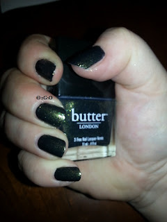
Next up is Hampstead Heath, a super-sparkly evergreen color packed with gold shimmer. This was an amazing polish, totally opaque and so easy to apply. My only issue with it? The green doesn't photograph well. It kept coming out cocoa colored! Strange, as I don't really see brown when I look at this polish.
 |
| See? Brown. But it's not-just wait. Outdoors, weird pink afternoon light again. |
 |
| This is closer. Outside, forced flash. |
 |
| Indoor incandescent light. The green's getting closer... |
 |
| Indoor forced flash. Finally, an almost-accurate depiction! |
Be sure to click through on those pictures, especially that last one. You can see the gold shot through the green. This polish is gorgeous and so appropriate for the season!
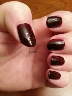
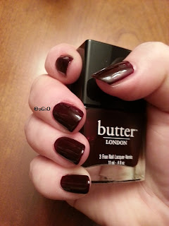
And I saved the best for last. Abso-bloody-lutely is my favorite of this triad of colors! It's a dark red, reminds me of a lot of the Vamped-up reds that have been around for a while, but this one makes me swoon. If I could have gotten the first coat to go on smoothly, I would have stopped there. Alas, I am not very talented that way, so I was forced into two coats. Not that I'm sorry--it's just that the first coat was such a vibrant darkish red that I fell in love. Then with the second coat, I fell in love all over again. And here's why.
 |
| Indoor, incandescent light. |
 |
| Indoor, forced flash. |
By the time I got finished with the Seche Vite top coat, it was Full Dark No Stars outside. I can't wait to get this baby into the sunshine! Obviously I'd recommend this polish. The color is rich and smooth and totally opaque in two coats. Quick, go get it, before it's too late!


Very Pretty colors! Like!!
ReplyDelete